
PROGRAM
ARC
Brand Identity
The full visual language of a brand, built as one system.

Why this arc matters?
Every strong brand becomes unmistakable through its identity. Not through a logo. Not through a colour. Through a complete visual language that holds across every package, every screen, every season.
Identity is built on listening. To who the brand is for, where it lives, and what makes it different from everything else competing for the same attention. In a market where templates and AI-generated marks have made sameness free, an identity built with original thinking is what gives a brand its ground to stand on.
This is the foundation everything else stands on.
At IVAMO, we build identity as one system, not a set of individual deliverables.
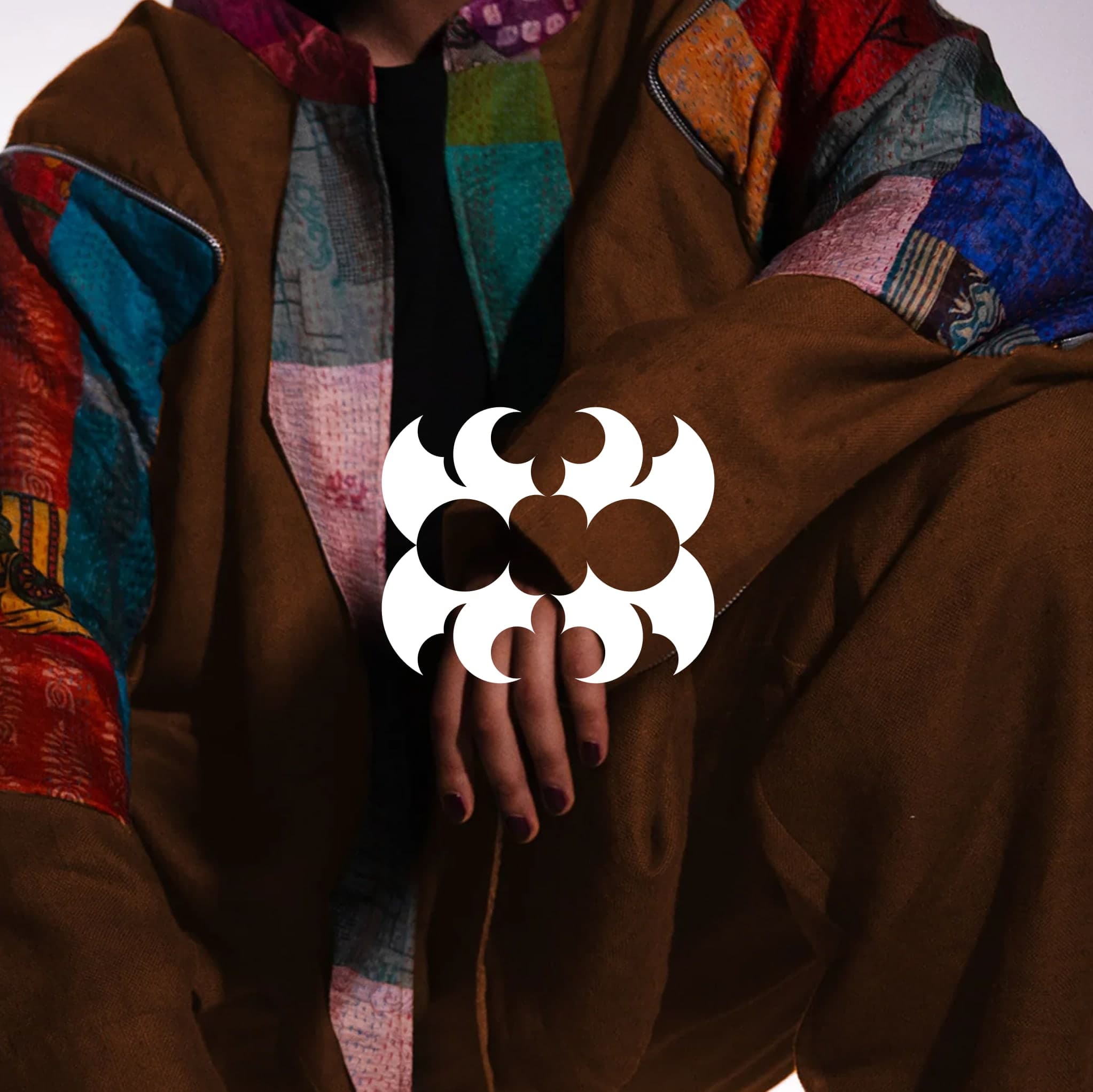
The mark, the type, the colour, the packaging is designed together so they hold together. Not assembled from parts. Not handed off between teams. Built once, with intention, by the same hands, from the same understanding of what the brand is and who it is for.
Because an identity built as one system is owned completely. The brand stays the brand, year after year, no matter who manages it.
What this arc offers
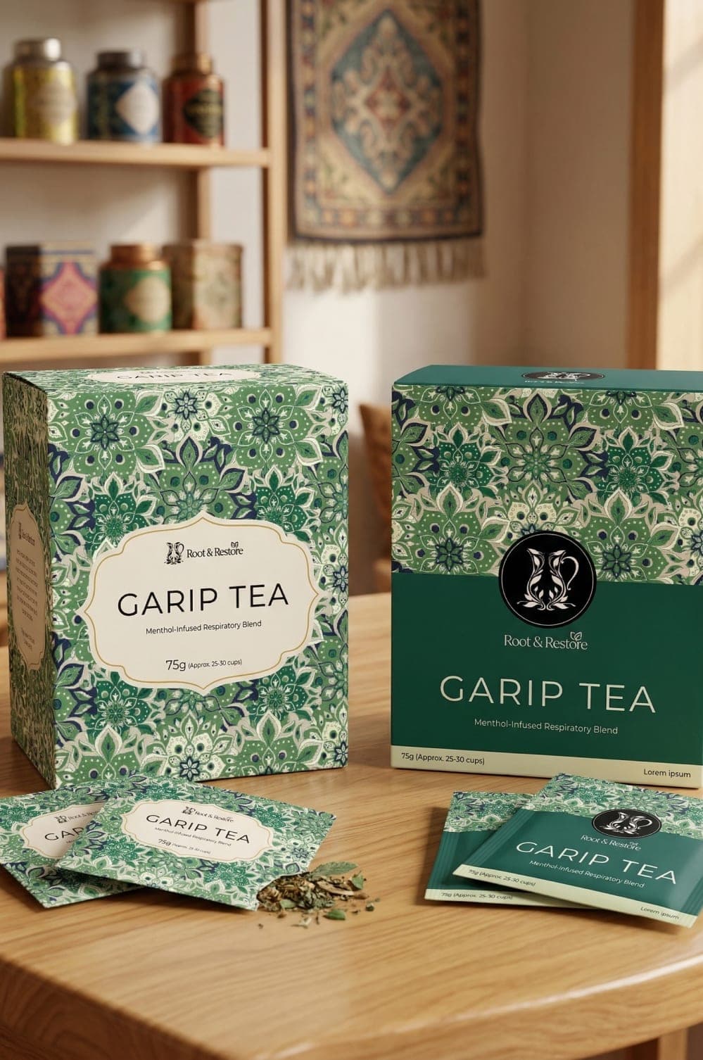
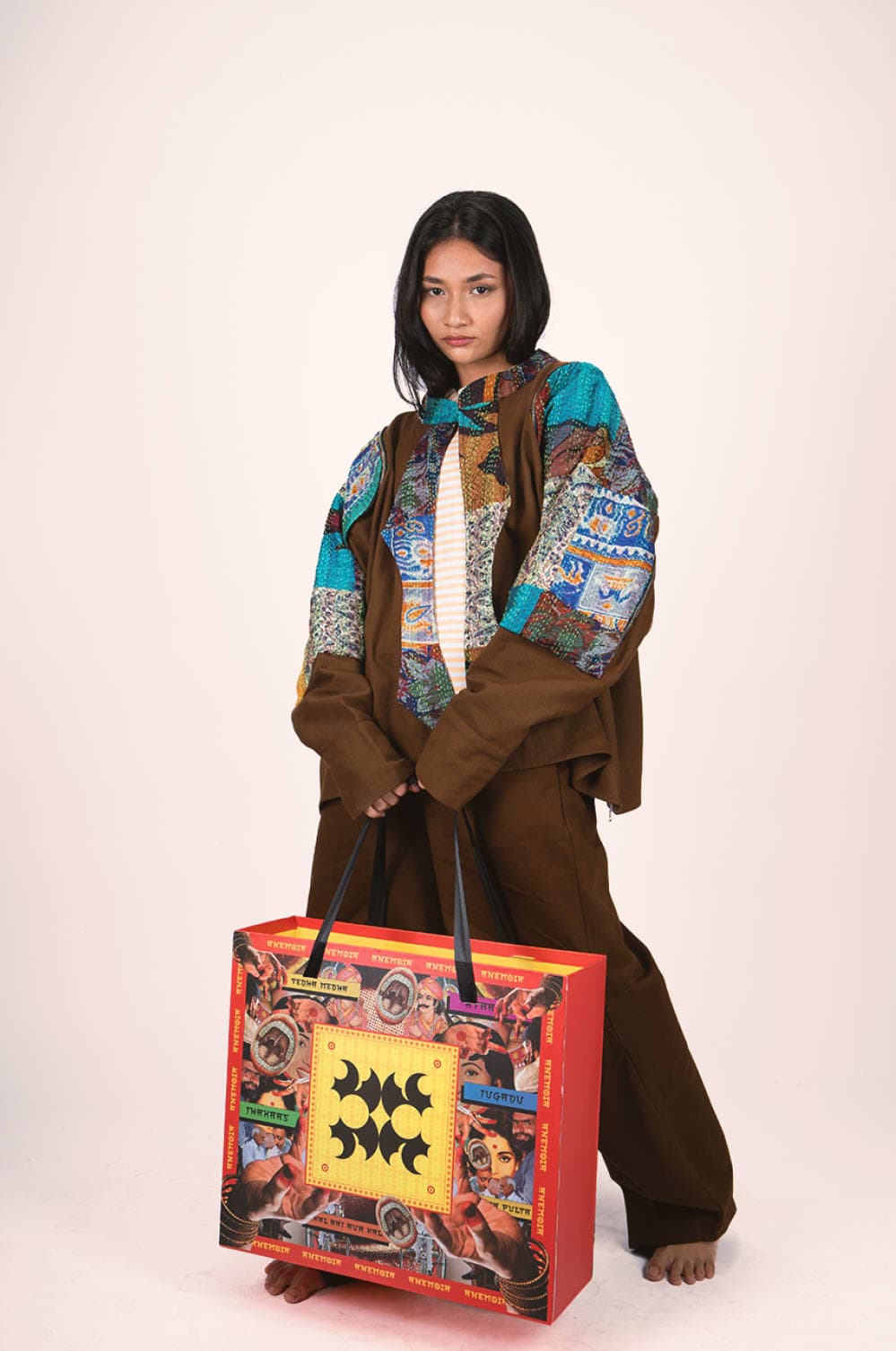
Logo and mark system
A complete identity mark built to hold across every scale and surface.
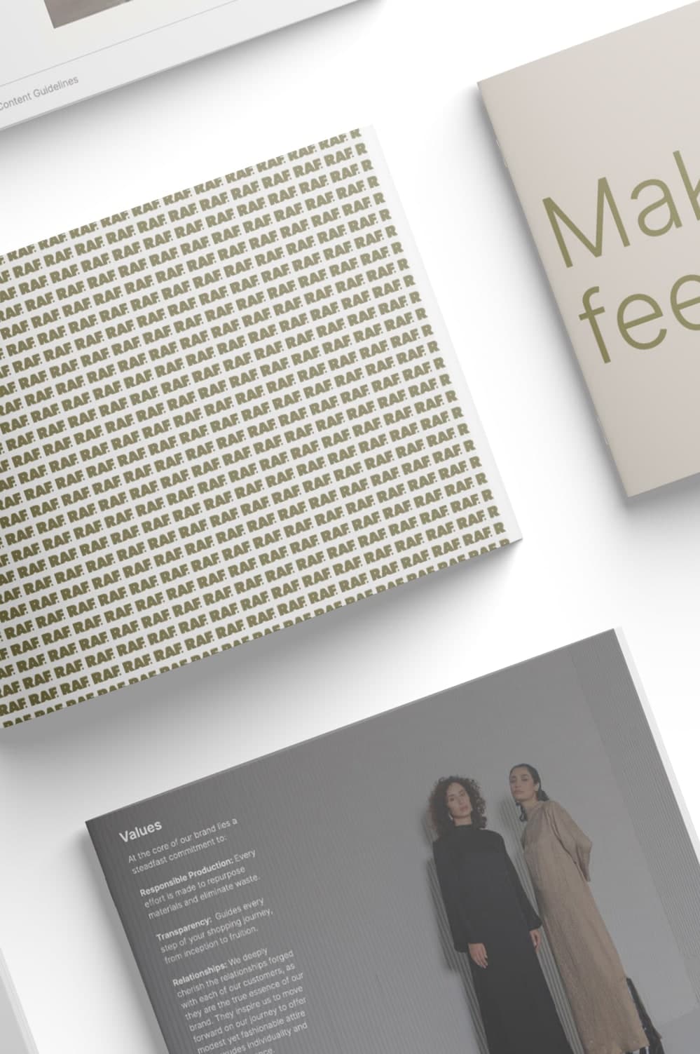
Typography systems
A considered type palette that carries the brand's voice into every layout.
Colour systems
Colour built with logic and intention, not preference.
Packaging design
The physical expression of the brand, designed as part of the identity system.
Brand guidelines and applications
A complete brand book built to keep the identity consistent, no matter who joins the team or when.
Digital and offline surface applications
The identity applied across the channels where the brand actually lives.